Biggest UX Problem with Desktop App Landing Pages
Discover how to enhance the user experience on app landing pages by providing QR codes, email/phone forms, and multiple download options, ensuring a seamless conversion process from visitor to customer.
Intro #
The goal of a landing page is to convert visitors into customers. Ideally, this process should be as smooth as possible.
Let’s look at how a visitor becomes a customer. For example, let’s examine the Photomath landing page on a desktop.
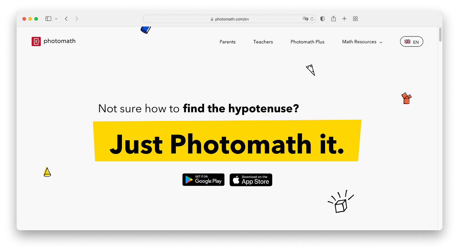
The website shows links to download the app from the App Store and the Play Store. Both links take users to their app market websites. If a visitor uses the Play Store, they can install the app on their Android phone remotely. However, if they use the App Store, this option is not available.
So, what can a visitor do with the App Store link? A visitor using macOS (but not Windows or another PC) can send the link to their phone using AirDrop. Another option is to open the App Store on their phone and search for the app manually. These options work, but they are not very convenient. Even with the Play Store, the visitor still has to log in to their account.
How to Resolve This Issue? #
There are at least two ways to improve this experience:
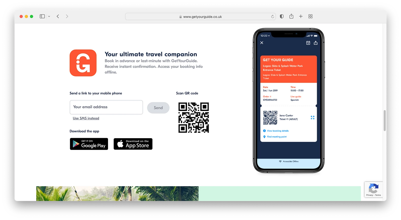
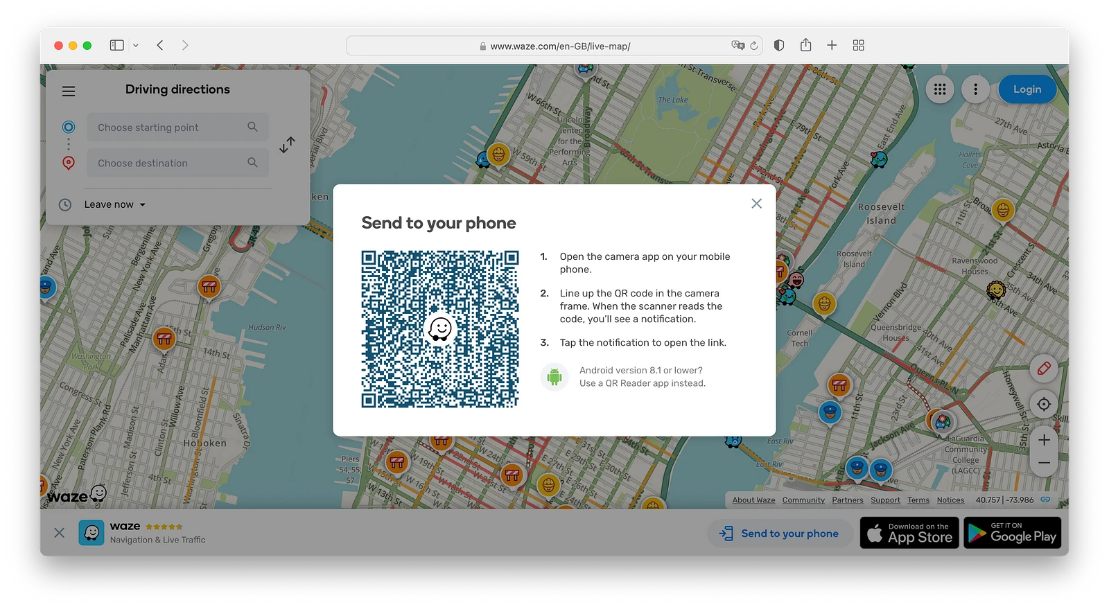
- Provide a QR code for downloading the app.
Visitors can open their phone’s camera and point it at the QR code. The camera will take them directly to the app’s page in the app store.
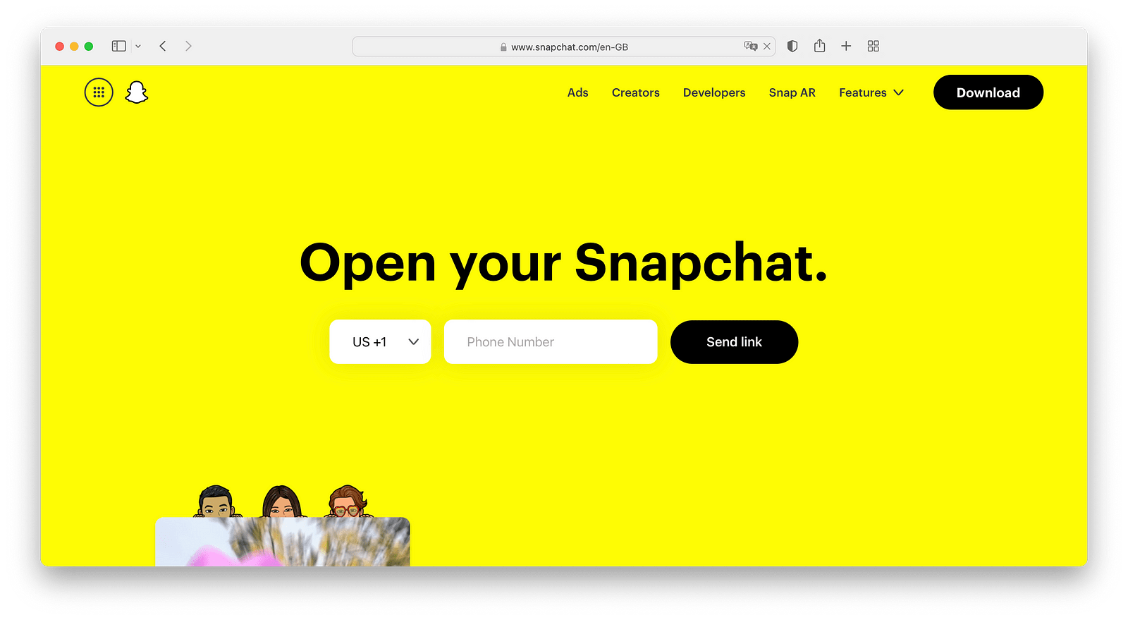
- Add an email or phone number form to your landing page.
This is a win-win situation! You can send the download link directly to the visitor’s phone, and you also collect their contact information for future marketing.
- Offer multiple download options on the same page.
This gives the visitor all the available ways to download the app in one place.